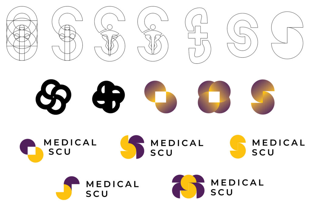
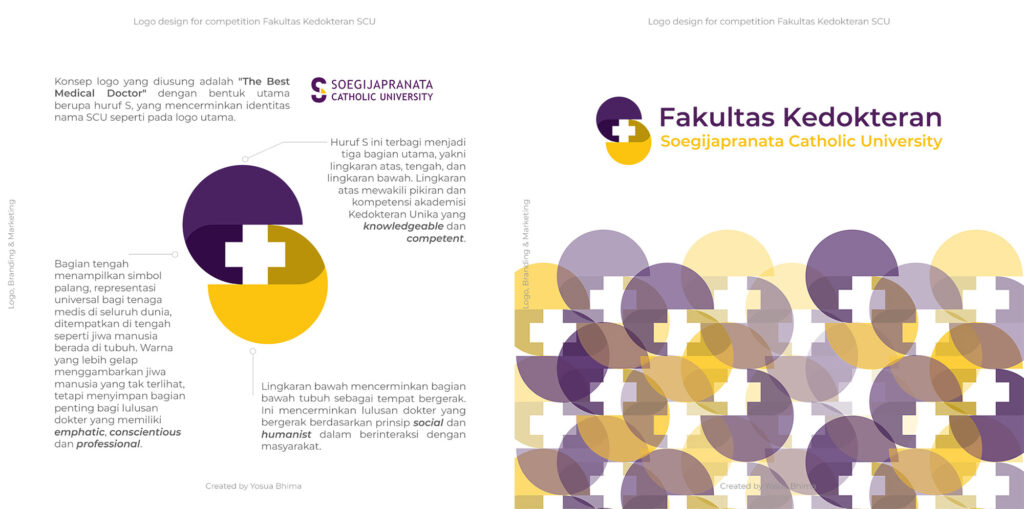
The logo designed for Medical SCU reflects the theme “The Best Medical Doctor” through a sophisticated visual representation of the letter “S,” symbolizing SCU’s identity. The “S” is thoughtfully divided into three distinct sections, each representing core values and attributes of medical professionals.
The upper circle stands for the academic competence and knowledge of SCU’s medical students, showcasing their intelligence and skill. The middle section contains the universal medical cross, symbolizing the central role of the human soul and spirit in medical practice. Positioned at the core, the cross emphasizes the qualities of empathy, professionalism, and conscience—vital traits for any medical professional. The darker hue in this section represents the unseen essence of the soul, which guides these empathetic and caring professionals.
Finally, the lower circle represents the movement and action of medical graduates. This section illustrates how SCU’s doctors embody social and humanist principles, engaging with society through service and care. It symbolizes the physical actions that medical professionals take in the world, powered by compassion and a desire to positively impact communities.
The color scheme and geometric balance of the logo were carefully designed to ensure harmony and clarity, making the logo not only a visual identifier but also a representation of SCU’s holistic approach to medical education.