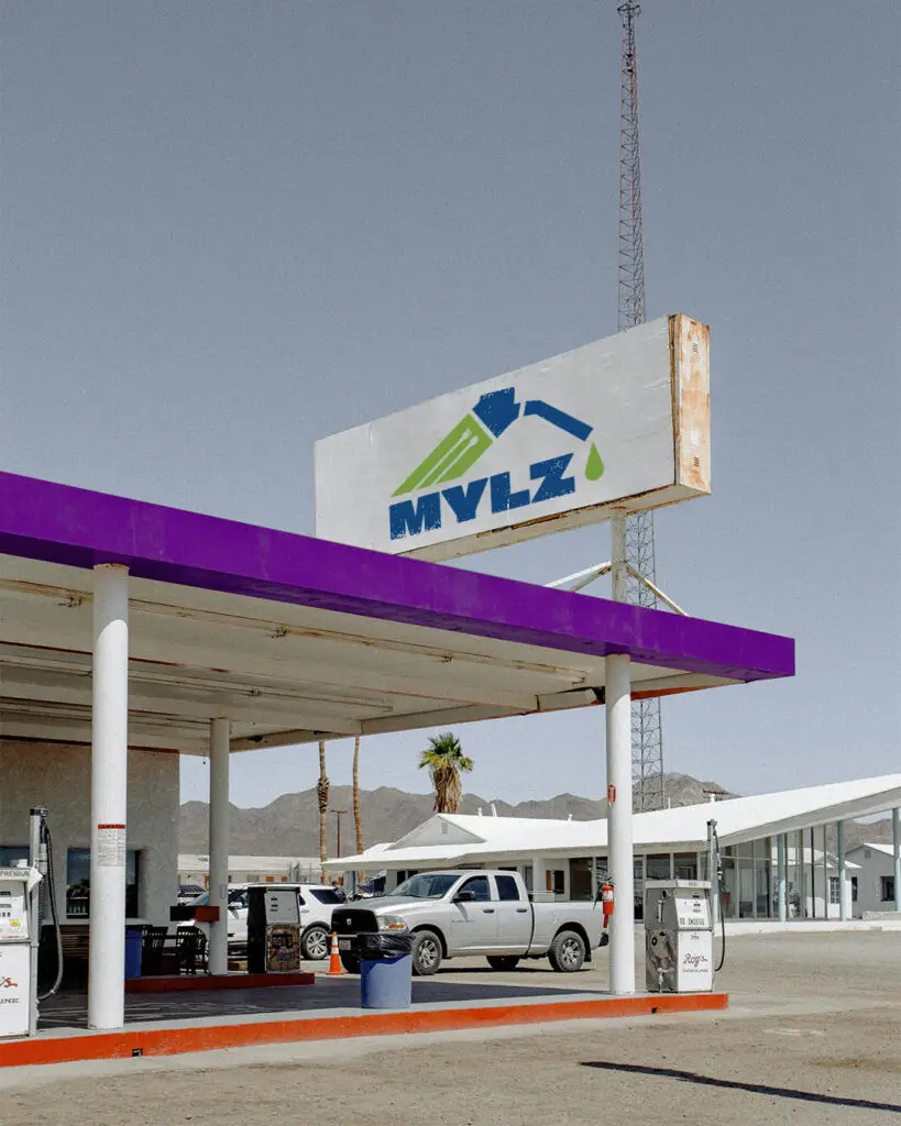
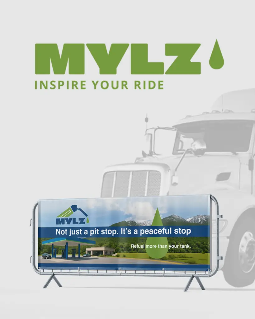
Designing the MYLZ logo started with one core idea: creating an identity that reflects a gas station built not just for fueling, but for pausing, breathing, and enjoying the journey. MYLZ isn’t a typical rest stop, it’s a place where movement meets comfort, where travelers can fill their tank, eat good food, and relax with a view of nature. I wanted the logo to capture that feeling. The name itself, MYLZ, carries the sense of distance and adventure, so I shaped the symbol to express motion while keeping it calm and grounded. Clean lines show a sense of direction, while open spacing hints at the natural environment that surrounds each location. The wordmark was designed to be bold and instantly recognizable on the road, with strong forms that communicate reliability and modernity. The color palette blends the energy of travel with the tranquility of a scenic rest. Every decision in the process aimed to translate MYLZ’s purpose into a visual mark that feels alive yet peaceful — a logo that welcomes travelers in, offering not just fuel, but a moment to refresh before continuing the journey.